ShopDreamUp AI ArtDreamUp
Deviation Actions


Suggested Deviants


Suggested Collections


![Day27 [COOLEST] Grovyle](https://images-wixmp-ed30a86b8c4ca887773594c2.wixmp.com/f/164799f4-a029-4c5d-b37e-2f912fd9fe6d/d6zp96c-be0c18d8-ebf5-4bc6-8602-1dc9cd8ed5fc.png/v1/crop/w_184,h_184,x_0,y_8,scl_0.15333333333333,q_70,strp/day27__coolest__grovyle_by_rock_bomber_d6zp96c-92s-2x.jpg?token=eyJ0eXAiOiJKV1QiLCJhbGciOiJIUzI1NiJ9.eyJzdWIiOiJ1cm46YXBwOjdlMGQxODg5ODIyNjQzNzNhNWYwZDQxNWVhMGQyNmUwIiwiaXNzIjoidXJuOmFwcDo3ZTBkMTg4OTgyMjY0MzczYTVmMGQ0MTVlYTBkMjZlMCIsIm9iaiI6W1t7ImhlaWdodCI6Ijw9MTE5NSIsInBhdGgiOiJcL2ZcLzE2NDc5OWY0LWEwMjktNGM1ZC1iMzdlLTJmOTEyZmQ5ZmU2ZFwvZDZ6cDk2Yy1iZTBjMThkOC1lYmY1LTRiYzYtODYwMi0xZGM5Y2Q4ZWQ1ZmMucG5nIiwid2lkdGgiOiI8PTEwMjQifV1dLCJhdWQiOlsidXJuOnNlcnZpY2U6aW1hZ2Uub3BlcmF0aW9ucyJdfQ.lGRAgRqfFTIG_Sw-tZjib5BGhOo5E_nr_A4H9BztnQ0)
![Day27 [COOLEST] Grovyle](https://images-wixmp-ed30a86b8c4ca887773594c2.wixmp.com/f/164799f4-a029-4c5d-b37e-2f912fd9fe6d/d6zp96c-be0c18d8-ebf5-4bc6-8602-1dc9cd8ed5fc.png/v1/crop/w_92,h_92,x_0,y_4,scl_0.076666666666667,q_70,strp/day27__coolest__grovyle_by_rock_bomber_d6zp96c-92s.jpg?token=eyJ0eXAiOiJKV1QiLCJhbGciOiJIUzI1NiJ9.eyJzdWIiOiJ1cm46YXBwOjdlMGQxODg5ODIyNjQzNzNhNWYwZDQxNWVhMGQyNmUwIiwiaXNzIjoidXJuOmFwcDo3ZTBkMTg4OTgyMjY0MzczYTVmMGQ0MTVlYTBkMjZlMCIsIm9iaiI6W1t7ImhlaWdodCI6Ijw9MTE5NSIsInBhdGgiOiJcL2ZcLzE2NDc5OWY0LWEwMjktNGM1ZC1iMzdlLTJmOTEyZmQ5ZmU2ZFwvZDZ6cDk2Yy1iZTBjMThkOC1lYmY1LTRiYzYtODYwMi0xZGM5Y2Q4ZWQ1ZmMucG5nIiwid2lkdGgiOiI8PTEwMjQifV1dLCJhdWQiOlsidXJuOnNlcnZpY2U6aW1hZ2Uub3BlcmF0aW9ucyJdfQ.lGRAgRqfFTIG_Sw-tZjib5BGhOo5E_nr_A4H9BztnQ0)


You Might Like…


![[ENM] Kiss kiss fall in Floof](https://images-wixmp-ed30a86b8c4ca887773594c2.wixmp.com/f/47054a82-625f-48f8-9396-ea9e3c96223a/dbjup2w-ff2a2b94-4687-4e35-9fa3-60f4bbf838cd.png/v1/crop/w_184,h_184,x_27,y_0,scl_0.24831309041835,q_70,strp/_enm__kiss_kiss_fall_in_floof_by_squeakyarts_dbjup2w-92s-2x.jpg?token=eyJ0eXAiOiJKV1QiLCJhbGciOiJIUzI1NiJ9.eyJzdWIiOiJ1cm46YXBwOjdlMGQxODg5ODIyNjQzNzNhNWYwZDQxNWVhMGQyNmUwIiwiaXNzIjoidXJuOmFwcDo3ZTBkMTg4OTgyMjY0MzczYTVmMGQ0MTVlYTBkMjZlMCIsIm9iaiI6W1t7ImhlaWdodCI6Ijw9NjQ1IiwicGF0aCI6IlwvZlwvNDcwNTRhODItNjI1Zi00OGY4LTkzOTYtZWE5ZTNjOTYyMjNhXC9kYmp1cDJ3LWZmMmEyYjk0LTQ2ODctNGUzNS05ZmEzLTYwZjRiYmY4MzhjZC5wbmciLCJ3aWR0aCI6Ijw9MTAyNCJ9XV0sImF1ZCI6WyJ1cm46c2VydmljZTppbWFnZS5vcGVyYXRpb25zIl19.VUCpHEO2DSpR4-bhNHPvwzNtXitufi6n7AtW6PWknPI)
![[ENM] Kiss kiss fall in Floof](https://images-wixmp-ed30a86b8c4ca887773594c2.wixmp.com/f/47054a82-625f-48f8-9396-ea9e3c96223a/dbjup2w-ff2a2b94-4687-4e35-9fa3-60f4bbf838cd.png/v1/crop/w_92,h_92,x_14,y_0,scl_0.12415654520918,q_70,strp/_enm__kiss_kiss_fall_in_floof_by_squeakyarts_dbjup2w-92s.jpg?token=eyJ0eXAiOiJKV1QiLCJhbGciOiJIUzI1NiJ9.eyJzdWIiOiJ1cm46YXBwOjdlMGQxODg5ODIyNjQzNzNhNWYwZDQxNWVhMGQyNmUwIiwiaXNzIjoidXJuOmFwcDo3ZTBkMTg4OTgyMjY0MzczYTVmMGQ0MTVlYTBkMjZlMCIsIm9iaiI6W1t7ImhlaWdodCI6Ijw9NjQ1IiwicGF0aCI6IlwvZlwvNDcwNTRhODItNjI1Zi00OGY4LTkzOTYtZWE5ZTNjOTYyMjNhXC9kYmp1cDJ3LWZmMmEyYjk0LTQ2ODctNGUzNS05ZmEzLTYwZjRiYmY4MzhjZC5wbmciLCJ3aWR0aCI6Ijw9MTAyNCJ9XV0sImF1ZCI6WyJ1cm46c2VydmljZTppbWFnZS5vcGVyYXRpb25zIl19.VUCpHEO2DSpR4-bhNHPvwzNtXitufi6n7AtW6PWknPI)
Featured in Groups


Description
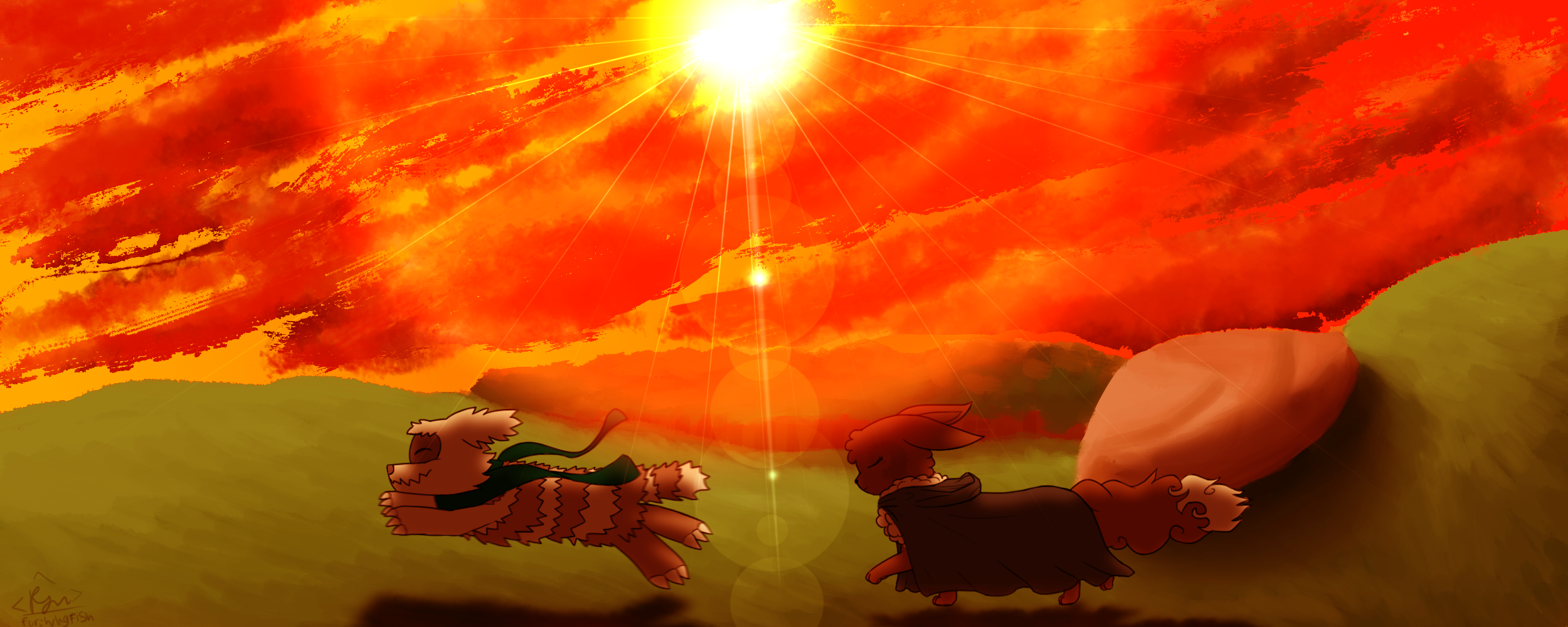
expiramental backgrounds ftw! *flops*
a birthday gift for wugfish ! Mal belongs to him
this was partially the result of a conversation of how mal would wear his scarf and wugs liked the idea of mal wearing it reverse drape style and running around with it flailing behind him in the wind~
Featuring Team Emerald Glare!
a birthday gift for wugfish ! Mal belongs to him
this was partially the result of a conversation of how mal would wear his scarf and wugs liked the idea of mal wearing it reverse drape style and running around with it flailing behind him in the wind~
Featuring Team Emerald Glare!
Image size
2500x1000px 1.79 MB
© 2014 - 2024 RymNotrim
Comments11
Join the community to add your comment. Already a deviant? Log In
This is my first critique, and I am by no means a professional, so you can feel free to take my advice with a grain of salt if you want, but here is how I feel about the work above.
The vision appears to be one competently arranged and well put together. Composition flows logically and is visually appealing. I can't say characters running against the sunset is the most original thing ever, but that's not really a true flaw, in my opinion - it's common because it's striking.
What gets me is the technique. The sky is painted with what appears to be red and orange brush strokes. It creates a very unique image full of impact which stands out right away. I particularly like the transition from orange to red from the left to the right of the sky. For the sky alone I would rate it highly. Characters are done quite well too. I particularly like how their fur and clothing moves in the wind - it creates a good sense of motion.
Unfortunately, while I love the experimental way the sky is done, the rest of the background seems a bit sloppy. The horizon appears shaky, as if the grass was painted on with a mouse and the brush tool. Detailing on the grass and rock are shaky at beast, and it doesn't really seem to glow with the orange light one would expect out of lighting conditions like that. Additionally, shadows appear a bit too weak for the setting, and sharper, more detailed shadows could benefit the work greatly. And a matter of personal opinion, but I don't like the lens flare you chose.
TL;DR
My opinion and suggestions are as follows:
The Good:
-The sky is done phenomenally
-Lighting approached well; colors set mood
-Characters drawn well; clothing/fur implies motion
My Suggestions:
-More detailing on the other background elements would be nice. Particularly the grass
-Shadows could be sharper/more detailed. Personally, I would prefer them to be darker as well
-Maybe use a different lens flare
I hope my critique was helpful!